/ / / / / The Fixed Income Market
The Fixed Income Market
Introduction
What is Fixed Income
Table of Contents
- Introduction
- What is Equity/Shares
- Classification based on rights
- Chart 1 - Value added monthly index (VAMI)
- Return Comparison over time
- Chart 2 - Holding period return over various time windows
- Holding period return
- Table 1 - Holding period return
- Chart 3 - Annualised returns
- Annualised returns
- Chart 4 - Frequency return of equity
- Chart 5 - Cumulative frequency return of equity
- Distribution of monthly returns - Equity
- Descriptive statistics
- Table 2 - Descriptive statistics
- Chart 6 - Rolling 12 month standard deviation
- Rolling 12 month standard deviation
- Chart 7 - Mu-Sigma chart
- Mu-Sigma return for risk taken
- Chart 8 - Correlation
- Correlation
- Reference or additional material
Classification based on rights
To optimise a company’s profit, the chief financial officer would aim to minimise the weighted average cost of capital used to finance company’s activities. This is the balance between equity finance (shares) and debt finance. There are different kinds of shares based on the rights attached to the shares. As an example, you can give up your voting right for a right to get dividend before any other shareholders. Below is a list of the main types of equity you can invest in, you will note many of these instruments look very similar to a fixed income instrument. This illustrates why both fixed income and equity is a capital asset, you need to beware of limited diversification it offers in times of stressed markets.
| Share Type | Profit Share | Profit Share format | Share in retained profits | Insolvency protection | Return expectations | Volatility | Voting rights | Dividend Cumulative |
|---|---|---|---|---|---|---|---|---|
| Ordinary Shares | Proportionate share of company's profits after other claims, creditors, debt holders, preference share holders. | Dividends | First in line | Last in line | Higher returns | High volatility | Yes | No |
| Ordinary preference shares | Only entitled to preference dividend when declared. Normally declared before normal dividend is declared | Preference Dividends | None | Slightly ahead of ordinary shares | Fixed Income Return Profile | Lower volatility | No | No |
| Cumulative preference shares | Entitled to a fixed percentage dividend on annual basis. If no dividend declared needs to be paid out in future years before ordinary dividends are paid | Preference Dividends | None | Slightly ahead of ordinary shares | Fixed Income Return Profile | Lower volatility | No | Yes |
| Non-cumulative participating preference shares | Fixed dividends like preference share with voting rights | Preference Dividends | None | Slightly ahead of ordinary shares | Fixed Income Return Profile | Lower volatility | Yes | No |
| Profit sharing preference shares | Preference dividends and distributable reserves | Preference Dividends | Yes | Slightly ahead of ordinary shares | Fixed Income Return Profile | Lower volatility | No | No |
| Non-redeemable preference shares | Mostly issued by banks for Basel 3 reasons, dividend linked prime rate | Preference Dividends | None | Slightly ahead of ordinary shares | Fixed Income Return Profile | Lower volatility | No | Possible |
| Redeemable Preference shares | Can take any form of the preceding preference shares, the company has the right to buy it back at predetermined dates. This can be at face value, a discount or even a premium | Preference Dividends | Possbile | Slightly ahead of ordinary shares | Fixed Income Return Profile | Lower volatility | Possible | Possible |
| Irredeemable preference shares | These preference shares exist as long as the company is solvent. They pay fixed percentage dividend that can be cumulative | Preference Dividends | Possible | Slightly ahead of ordinary shares | Fixed Income Return Profile | Lower volatility | Possible | Possible |
| Convertible preference shares | These are preference shares that can be converted into ordinary shares, normally at an option premium | Preference Dividends | Possible | Slightly ahead of ordinary shares | Fixed Income Return Profile | Lower volatility | Possible | Possible |
Chart 1 - Value Added Monthly Index (VAMI) of Fixed Income Investments
Return Comparison Over Time
Chart 1 above is an illustration of the compounded return you would have gotten if invested into the assets classes. This is actual returns based on an index representing the asset class for a country (USA in this case) over the last ten years.
Chart 2 - Holding Period Return over Various Time Windows
Holding Period Return
Chart 1 looked at return over an extended period and grew it on a monthly basis. You would also like to know what if you are invested for a shorter time period? Chart 2 above look at what was the holding period return over various time windows. We took the last 10 years of the index returns and work out what was the return if you invested for the first 12 months. Then we looked at what was the return if you invested for 12 months from the second month to the 13 month. We repeated the process until we looked at the last 12 months. We then calculated the average return for 12 months the first blue star on the chart. We also looked at what was the worst (green block) and best (blue triangle) 12 month window.
We then repeated the process using a 24 months window until we got to a 120 month window. Table 1 below shows the numbers of this exercise.
Table 1 - Holding Period Returns
| One Year HPR |
Two Year HPR |
Three Year HPR |
Four Year HPR |
Five Year HPR |
Six Year HPR |
Seven Year HPR |
Eight Year HPR |
Nine Year HPR |
Ten Year HPR |
|
|---|---|---|---|---|---|---|---|---|---|---|
| Minimum | -6.98% | 1.86% | 16.11% | 32.23% | 38.47% | 56.10% | 90.12% | 116.78% | 135.29% | 265.58% |
| Average | 13.03% | 28.8% | 46.90% | 64.32% | 82.12% | 110.22% | 143.57% | 172.54% | 195.77% | 265.58% |
| Maximum | 32.4% | 55.4% | 86.1% | 107.9% | 113.4% | 153.2% | 198.5% | 227.0% | 236.6% | 265.6% |
| Range | 39.37% | 53.53% | 69.94% | 75.66% | 74.97% | 97.06% | 108.28% | 110.22% | 101.26% | 0% |
Chart 3 - Annualised Returns
Annualised Returns
It is easy to compare returns of the same holding period. Often you would like to compare return of different holding periods, that is why we annualise returns to make comparison easier. In chart 3 we worked out the annualised return for 1, 3 and 5 years to enable comparison. We based this on the minimum average return, the maximum and for time window ending July 2020.
Chart 4 - Frequency Return of Equity
Chart 5 - Cumulative Frequency Return of Equity
Distribution of Monthly Returns - Equity
Chart 4 is a frequency distribution that shows how often a return is generated on a monthly basis. You can see the most frequently occurring values are around 3.5% with 32 observations. This shows most of the returns are larger than 2.5% and less than 4.5%. The second most occurring observations are between 0.5% and 2.5% followed by observations of between 4.5% and 6.5%.
You also notice that the observations are not normally distributed, have a slight skew to the right, hinting at more positive observations than negative ones.
Chart 5 is a cumulative frequency distribution chart which has a steep upward angle. Based on distribution dispersion only around 20% of the time would you expect to get a negative return.
Descriptive Statistics
Looking at table 2, equity has the highest average monthly return, followed by real estate. Equity on average generates 4 times more than fixed income. You also notice that equity is almost 4 times more risky if measured by standard deviation (Stdev).
Equity has larger minimum and smaller maximum return when compared to real estate, implies a less risky asset profile despite having a higher average return.
Table 2 - Descriptive Statistics
| Equity | Real Estate | Fixed Income | |
|---|---|---|---|
| Minimum | -12.35% | -19.95% | -2.37% |
| Average | 1.16% | 0.85% | 0.25% |
| Maximum | 12.8% | 13.6% | 3.0% |
| Range | 25.17% | 33.51% | 5.37% |
| Median | 1.62% | 0.99% | 0.04% |
| Stdev | 3.86% | 4.42% | 0.88% |
| Skewness | -0.43 | -0.82 | 0.59 |
| Kurtosis | 1.65 | 3.9 | 0.93 |
Chart 6 - Rolling 12 Month Standard Deviation
Rolling 12 month standard deviation
Standard deviation is a normal measure for risk, as gives an estimate of the range of returns one can expect. Chart 6 gives the rolling 12 month standard deviation of 4 main asset classes. You can see equity and property are the more volatile asset classes. The important thing to note is the risk level is not constant over time, it increases and decreases. This volatility you need to beware of when investing into equity as an asset class.
Chart 7 - Mu-Sigma Chart
Mu-Sigma Return for Risk Taken
Taking risk is to earn a return, ideally more return than risk taken. The Mu-Sigma Chart is a quick visual way to see if an investment gives more return that risk associated with it. The lines named 1 to 1, 1 to 2, 1 to 3 are your visual ques, that act as your risk guidelines. Any return that plots below the 1 to 1 line offers less return than risk taken. It it plots above 1 to 1 line it gives more return for risk take. It continues from that point onwards with some investments offer better than 3 units of return for 1unit of risk taken.
Here you can see in this case equity gave just barely better return than risk taken. This can be due to the way the index used to measure the asset class returns is constructed or the time under investigation (10 years in this case).
Chart 8 - Correlation
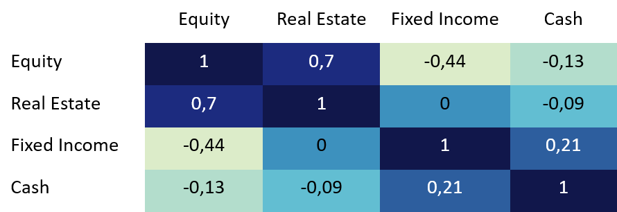
Correlation
Equity and Real estate has the highest correlation, this is expected as you can see in Chart 1 the return profile is similar. The lowest correlation is between equity and fixed income, for this reason it is often paired in portfolio optimisation.
Unfortunately, this is naïve diversification, the correlation is low mostly not permanently. In times of stressed environment, the correlation increase rapidly. The benefit of diversification is quickly eliminated.
Reference/Additional Material
Dow Jones U.S. Real Estate Index
Typical Real Estate Country Focused Index
https://www.spglobal.com/spdji/en/indices/equity/dow-jones-us-real-estate-index/#overview
S&P U.S. Treasury Bill 0-3 Month Index
Proxy for Cash/Money Market
https://www.spglobal.com/spdji/en/indices/fixed-income/sp-us-treasury-bill-0-3-month-index/#overview
S&P 500®
Typical Equity Country Focused Index
https://www.spglobal.com/spdji/en/indices/equity/sp-500/#overview
S&P U.S. Treasury Bond Index
Typical Fixed Income Country Focused Index
https://www.spglobal.com/spdji/en/indices/fixed-income/sp-us-treasury-bond-index/#overview